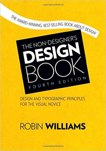
# Book Review: The Non-Designers's Design Book
Mar 6, 2018 2 minute readHave you ever looked at a flier and felt that it was ugly? Or at an Apple billboard and felt that it was pretty? Do you feel like you can differentiate a good design from a bad one without knowing why? Then this book is for you.
The Non Designer’s Design Book is structured around the premise that once you can identify a handful of design elements you’ll be able to determine what is wrong with a design, and consequently correct it.
Robin Williams did a great job conveying design expertise with the printed edition. The paper quality, the typography the colors, are just superb. How do I know? I read the book. [Grin].
The book teaches through hundreds of good and bad design examples. That being said, the author recognizes it is far from being a substitute to four years of design school.
Part 1: Design principles
Truly eye opening. This first part of the book covers in great detail the basic design principles: Contrast, Repetition, Alignment, Proximity, and Color. This section is sprinkled with multiple quizzes.
Part 2: Types
The author can’t deny her passion for typefaces. She covers in great detail the Categories and Relationships between typefaces. Practical examples of what to use when and where are abundant. As well as an extensive typeface reference.
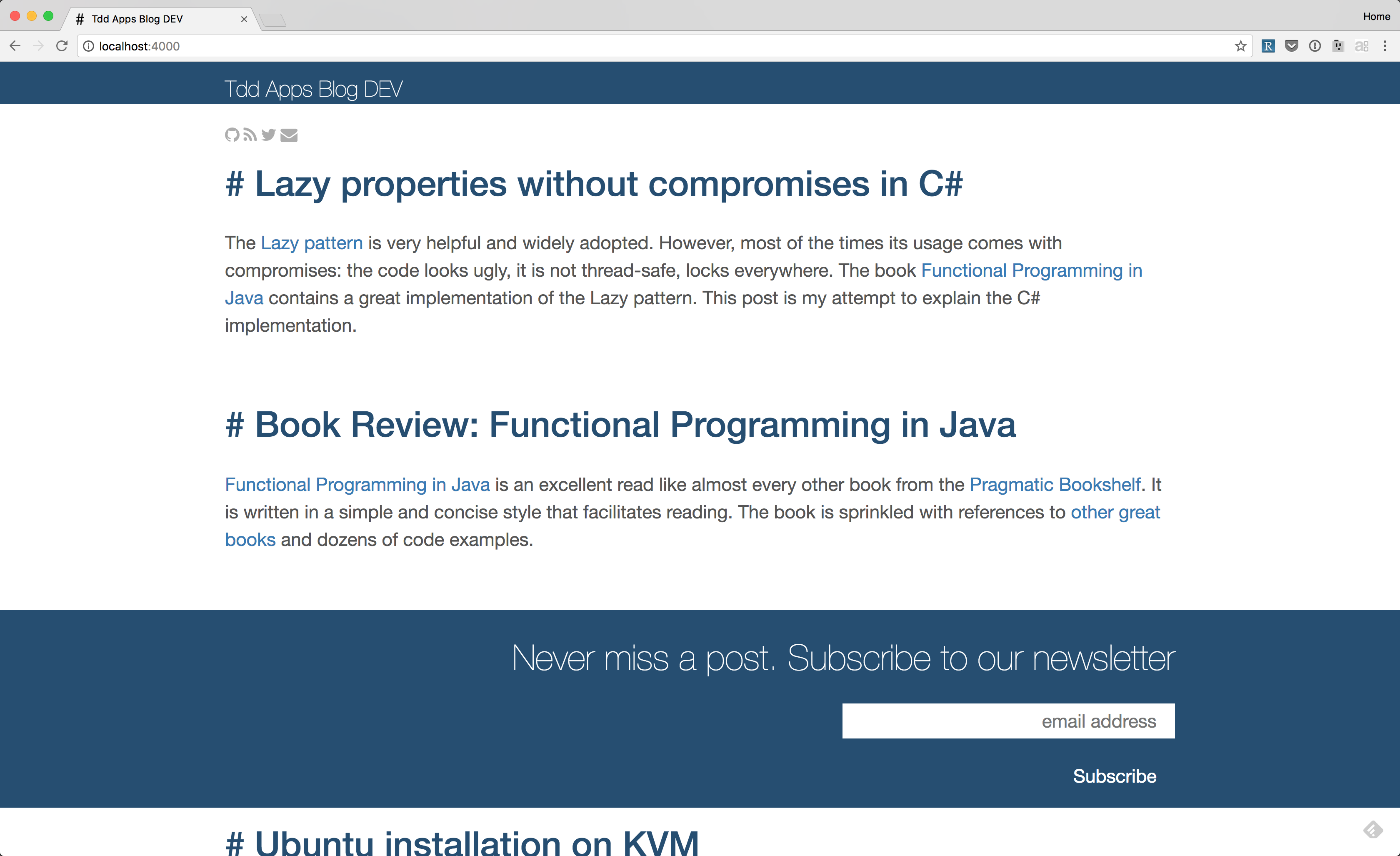
Case study: tddapps.com redesign
Being a software engineer by trade, my design expertise is limited to install Bootstrap. After reading The Non Designer’s Design Book I was able to redesign this blog with minimal effort.
Before

After
Not impressed with the changes?
Alignment: Everything in the updated version is aligned to the left. This makes the design dramatically better.
Contrast: Article titles are clearly distinguishable. They have a different font size and color from the article summaries. The website name can be clearly differentiated as well as the newsletter signup form.
Proximity: Although there is a considerable amount of whitespace between articles, the summaries are close to their respective titles.
Repetition: Every article title has the same # prefix.
Summary
Design is everywhere. Being able to identify good and bad designs can be a powerful skill for anyone. The Non Designer’s Design Book is a concise and easy-to-read book with many practical lessons.